Branding/Logos
Logos
we've created
The reality is that YOUR BRAND is what people think of you, your products, or your company. It’s more than just a logo, and by the way, making your logo bigger is not what will convince people to buy your stuff. Your brand needs to encompass your values, demonstrate what you and your company stand for, and show customers what you offer THEM in a crowded marketplace.
Often a brand starts with at GREAT LOGO! Here are just some we have created.
Our Work
The branding
of a new company
A brand new company who has a fantastic product aimed to get wounded soldiers out of harms way in the battlefield to safety in a hurry, chose us to create their brand identity.
Though much was involved, we want to give you a taste of the indentity we gave REX Rapid Extraction.
Our Work
The Rex LOGO
REX required a strong logo that showed forwarded movement, displayed urgent colors, and would be easily adaptable to a solid color environment, such as all red, all black. or all white.
We used the E to double as a subliminal arrow showing speed and movement. The X with the central circle showing the bullseye that is representative of our brave soldiers ready to extract an injured brother.
The Rex ICON
A strong easy to identify icon was required for this application. Every piece of life saving equipment would be branded with it. It needed to be eye-catching and match the company name and ideals.
What else could it have been!
Our bespoke T-Rex has to be iconic, print and stamp well on a verity of material, and also convey the power of the dinosaur but NOT be menacing. REX Extraction products are life saving, not life taking.
Initial Product Brochure
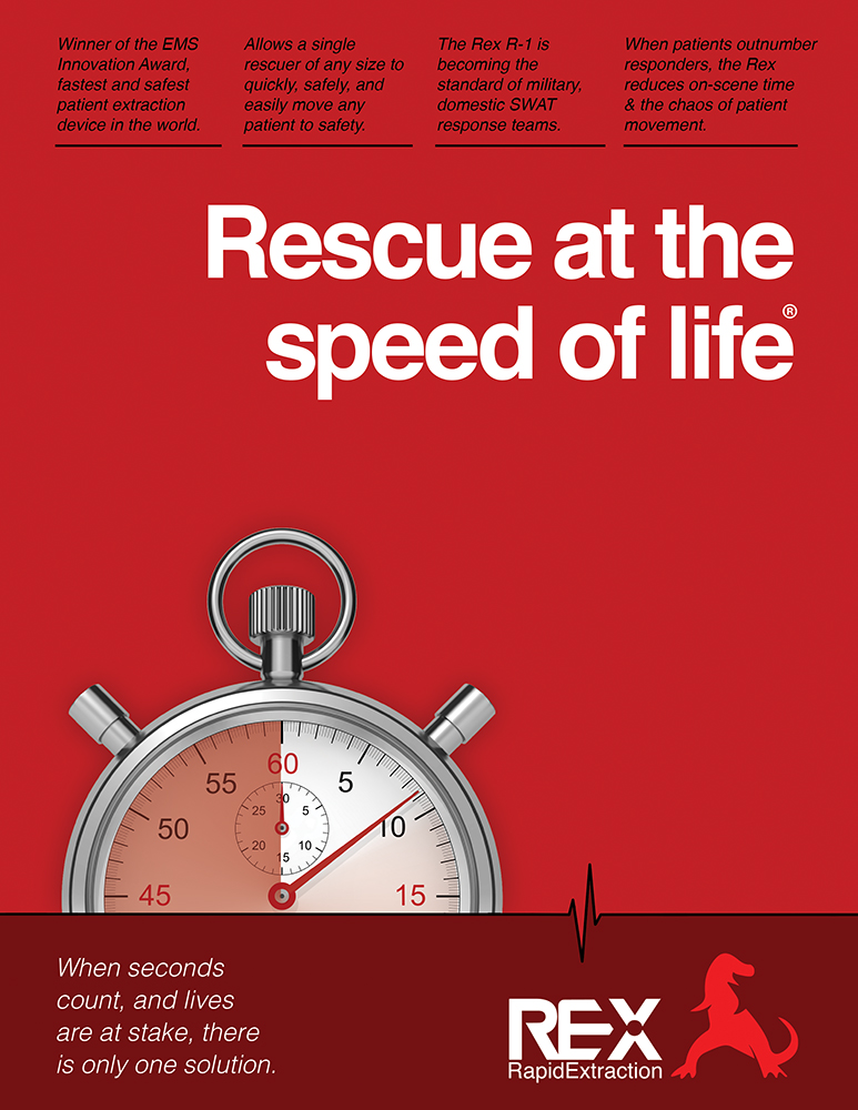
Since this was their introduction into the market, they needed a brochure that was sure to demand attention.
We created a style that was clean, simple, but used the REX color to demand attention. The stopwatch adds a more than subliminal sense of urgency to the piece.
The bold and clear slogan was key in tying it all together. We needed something that said it all in a few words. Rescue at the speed of life. It was so good that they registered it as their own.
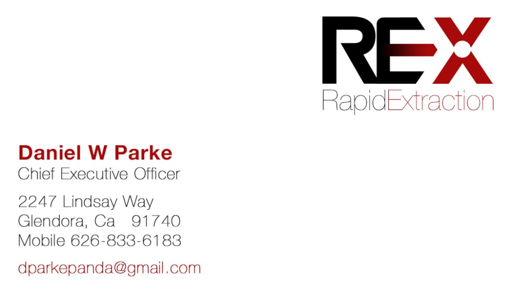
Business Cards
Even the business cards had to stand out and speak for the toughness of the product.
We carried the bold color for the cover, and an easy to read, clean and minimal back, that covers the contact information.
Like what we did for REX? To see example of how we branded an existing company stuck in the 70’s with a new cutting edge look, click below to see our Case Study of our success with UMF Medical.
See what we an do for you.
Contact Us
Let's
Connect
We’re passionate about creating e beautiful experience online or in print. If you are too, call or send us an email to get started.
