CASE STUDY
Rebranding UMF Medical

Behind the concept
The idea behind all our design and changes was simple. Make a company who’s nickname in the industry was UMF the people who make Ugly Metal Furniture, to become known as the Apple of medical exam table business.
We did it!
Here’s a quick visual case study of a head to toe rebranding project we took on. The company went from a stodgy 70’s look to a cutting-edge modern style that has been hailed as their industry best.
Services Provided
-
Art Direction
-
Animation
-
Branding
-
Brand Storytelling
-
Creative Writing
-
Copywriting
-
Content Management Systems
-
Content Production
-
Content Audit
-
Color Correction
-
Design
-
Development
-
Digital Marketing
-
eCommerce Web Design
-
Graphics
-
Hosting
-
Marketing
-
Motion Design
-
Maintenance
-
Plugin Development
-
Print Design
-
Product Design
-
Responsive Design
-
Strategy
-
Search Engine Optimization
-
Social Media Marketing
-
User Experience
-
Video Production
-
Visual Design
-
Video Production
-
Web Design
-
Web Development
-
WordPress
-
Wire-framing
-
WooCommerce
Rebranding...
01 The Logo
Corporate Logo
UMF Medical was reluctant to do a full redesign of their logo, so we did the next best thing. We kicked it up a notch.
Re-branding effort began with refresh of their logo.
- Updated positive colors
- A new tag-line that matches their brand ethos.
- Smoothed out swoosh
- Updated font




Logo on Product
UMF Medical used a solid color logo on their tables and medical chairs. They were using a solid taupe color for the logo which unfortunately blended into the tan body color of their product. We took the new logo and made it solid black. That gave it a contempory look as well as a high contrast that makes their brand easy to spot.
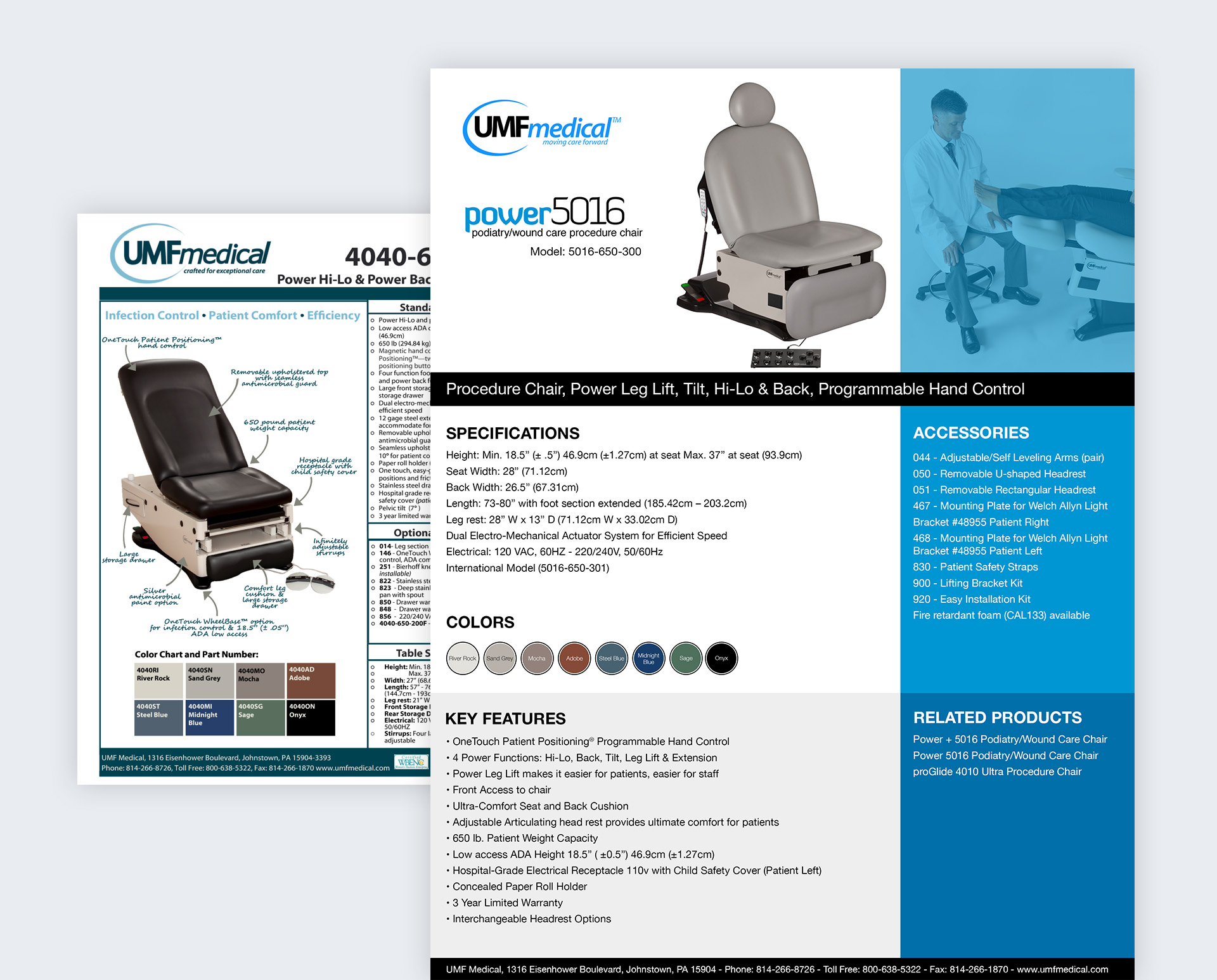
02 Product One Sheets
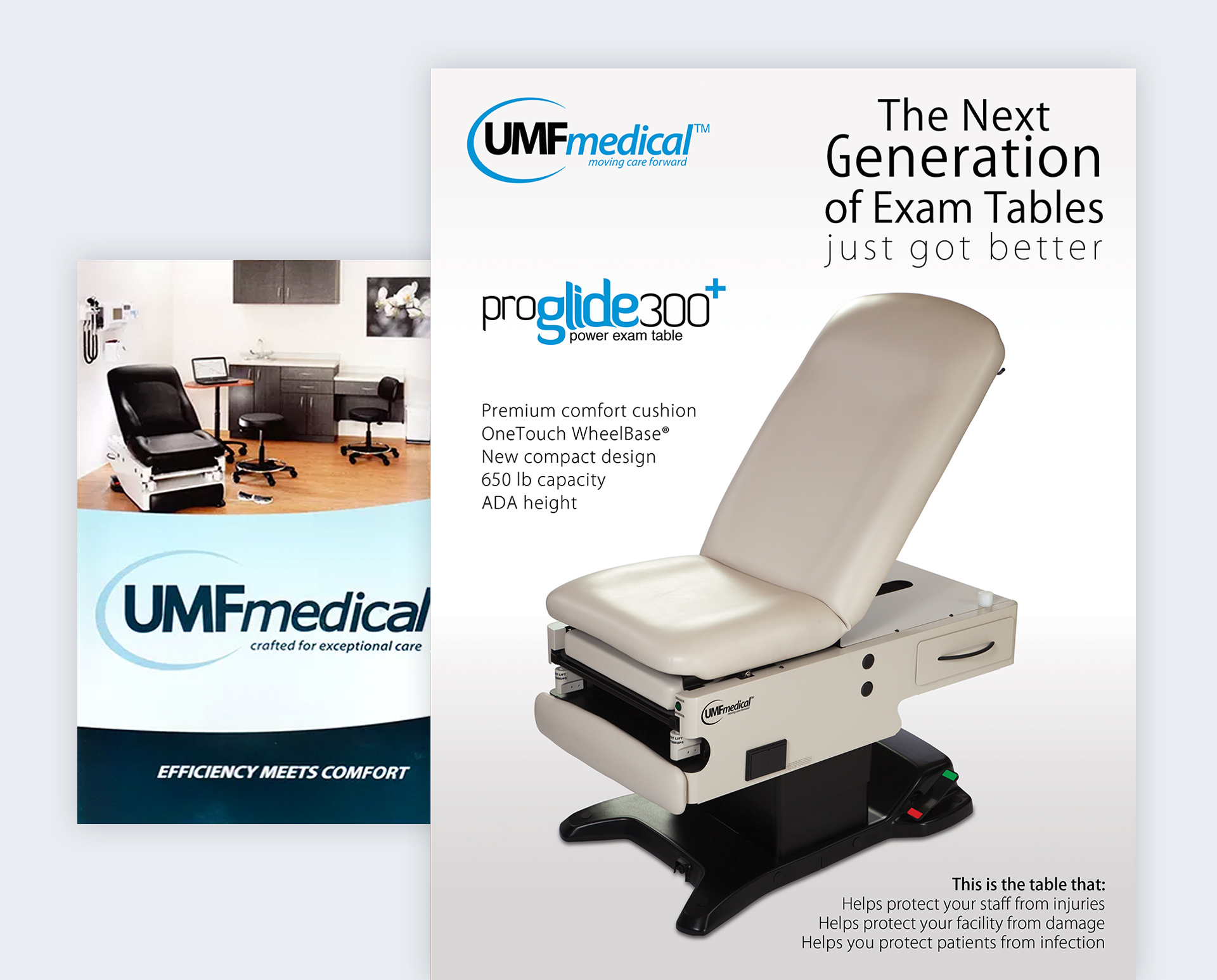
03 Product Brochures
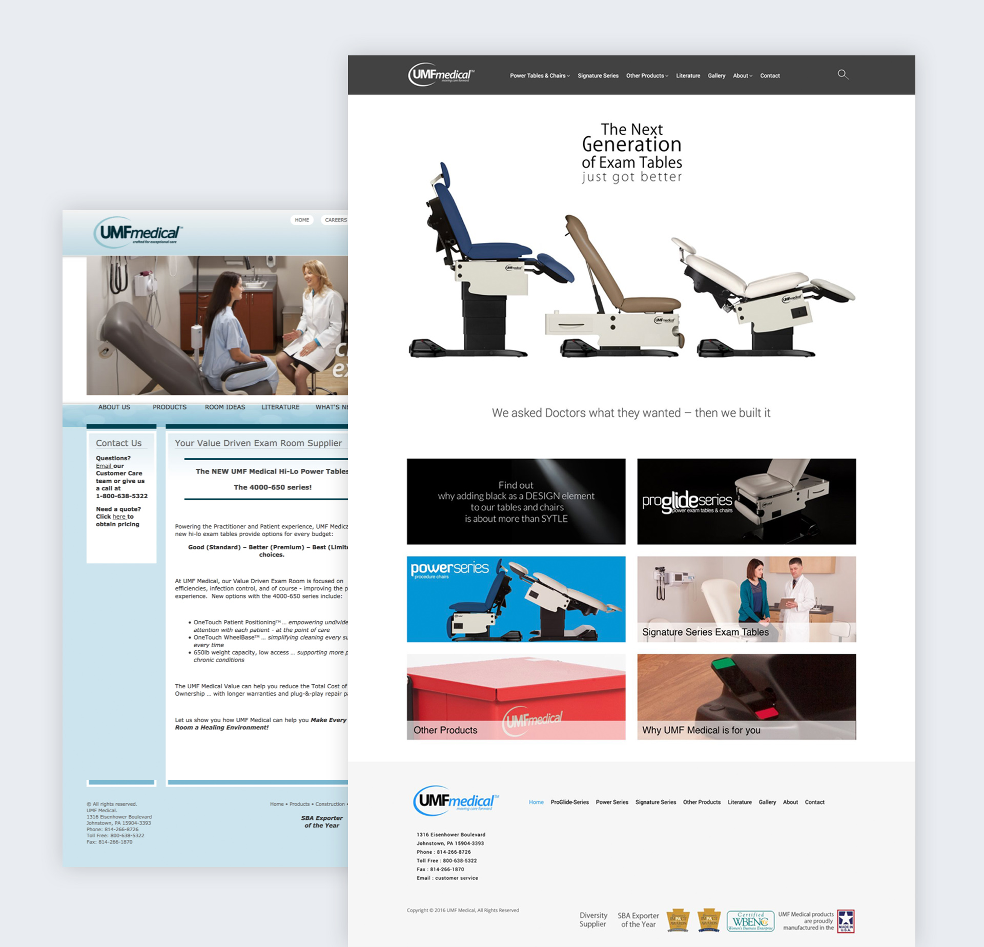
04 Website
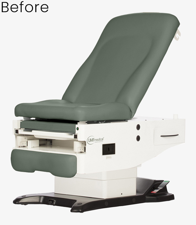
05 Product Redesign
One of the Power Chairs we helped redesign.
We could not do a ground-up redesign, but a cosmetic change was needed. We changed the shape of the chassis from a very standard shape to a new an iconic shape that reduced the profile size. This is in the effort to make the table less intimidating in an exam room. We also use our expertise on color, and how color affects people to reduce the size of the table even further. We blacked out the inner guts, so the would become invisible to the patient, and we also blacked out the center column that raises and lowers the table. With these two changes, the table takes on a whole different look and seems much smaller in size. The other important change was to the seat. We create a new seamless smooth, wider, and more luxurious seat for the comfort of the patient. All of these improvements made the able almost seem like it levitates off the floor, and focus’ attention to the comfortable seat. Positive changes like this have found to make a positive difference in the Dr. / Patient experience.
This chair and the others we redesigned have been widely praised and has helped UMF increase market share.
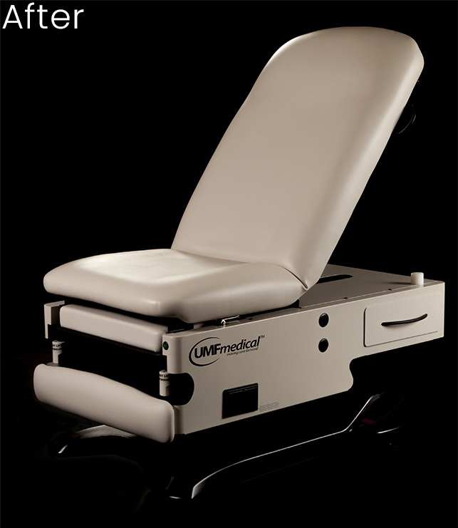
ProGlide Series
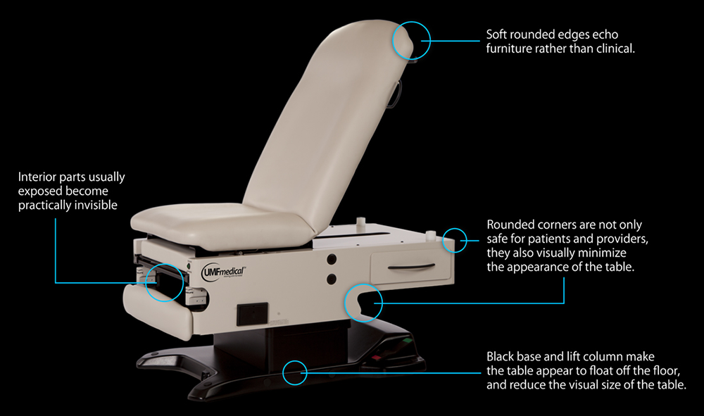
Some of our design changes to create a product that is getting rave reviews as well as penetrating markets never before reached.
We haven't scratched the surface.
Over the course of 4 years we touched every part of the UMF Product and Branding experience. There was literally area where we did not extensively redesign, rebrand, or re-image.
It was a wonderful experience to completely renovate and reinvigorate a company that was suck in the 70s.
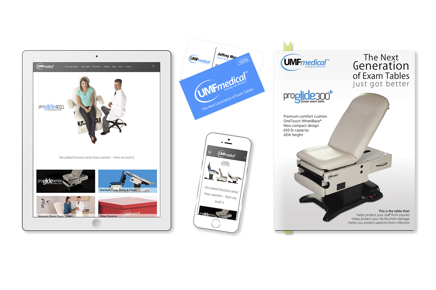
See what we an do for you.
Contact Us
Let's
Connect
We’re passionate about creating e beautiful experience online or in print. If you are too, call or send us an email to get started.
